

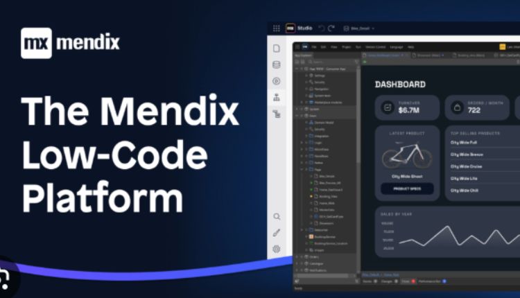
Building Responsive User Interfaces with Mendix
In the rapidly evolving world of software development, building responsive user interfaces has become a fundamental aspect of creating successful applications. Users expect seamless experiences across devices, whether they’re using a smartphone, tablet, or desktop computer. Mendix, a leading low-code platform, empowers developers to design and implement responsive interfaces with ease. This article will guide you through the process of building responsive user interfaces with Mendix, from understanding the basics to incorporating advanced techniques.
Building Responsive User Interfaces with Mendix
Creating user interfaces that adapt to different screen sizes and orientations is crucial for providing a positive user experience. Mendix solutions offer a range of tools and features that simplify the process. Let’s explore the key steps involved in building responsive user interfaces with Mendix.
The Importance of Responsive Design:
Responsive design isn’t just a buzzword; it’s a critical component of user-centric app development. With users accessing applications from an array of devices, from smartphones and tablets to desktops, delivering consistent and visually appealing experiences is paramount. Responsive design ensures that content remains accessible and usable, regardless of the screen’s dimensions, resulting in higher user engagement and satisfaction.
Mendix’s Responsive Design Capabilities:
Mendix simplifies the process of building responsive user interfaces through its intuitive visual development environment. By harnessing its low-code capabilities, developers can create layouts that automatically adjust based on screen size. This “design once, deploy everywhere” approach accelerates development cycles and minimizes the need for extensive manual coding.
Visit here for: Low-Code Development for Businesses
Flexible Layouts with CSS Flexbox and Grid:
Mendix leverages modern CSS technologies like Flexbox and Grid to provide developers with flexible layout options. These tools empower developers to design complex, dynamic layouts that adapt harmoniously to varying screen dimensions. With a few clicks, developers can create grids, columns, and rows that ensure content distribution is optimized across all devices.
Device-Specific Rules and Conditional Styling:
Mendix takes responsiveness a step further by enabling developers to define conditional styling and visibility rules based on device characteristics. This feature allows developers to customize the user interface to suit specific devices, enhancing both usability and performance. By tailoring experiences to the capabilities of each device, apps become more accessible and efficient.
The User-Centric Advantage:
Responsive user interfaces built with Mendix not only cater to user expectations but also bolster user engagement. By providing a consistent experience, regardless of device, users are more likely to interact with the app across various contexts. This, in turn, leads to increased user retention and positive word-of-mouth referrals.
The Future of App Development:
In a rapidly evolving technological landscape, the need for responsive user interfaces is more relevant than ever. Mendix’s commitment to empowering developers with responsive design tools reflects the platform’s understanding of user behavior and expectations. As the diversity of devices continues to expand, building responsive user interfaces using Mendix becomes a strategic imperative for staying competitive and delighting users.
Best Practices for Responsive Design with Mendix
To ensure your responsive user interfaces deliver exceptional user experiences, consider these best practices:
- Prioritize Mobile-First: Start designing for mobile devices and gradually enhance the layout for larger screens. This approach ensures that your application remains functional and visually appealing on all devices.
- Test Across Devices: Regularly test your application on various devices and screen sizes to identify any issues and fine-tune the responsive behavior.
- Optimize Performance: Minimize the use of large images and heavy assets, as they can slow down your application’s performance on mobile devices.
- Keep Navigation Intuitive: Design navigation menus that are easy to access and navigate, especially on smaller screens. Consider using collapsible menus or icons to save screen space.
- Provide Touch-Friendly Interactions: Optimize interactive elements, such as buttons and links, for touch interactions. Ensure they are appropriately sized and spaced to prevent accidental clicks.
FAQs
How does Mendix ensure a consistent user experience across devices?
Mendix employs responsive design principles, flexible grids, and dynamic widgets to automatically adapt the interface to different devices, ensuring a seamless and consistent user experience.
Can I customize the layout for specific devices?
Yes, Mendix allows you to define custom styling and conditions for different breakpoints, giving you the flexibility to tailor the layout and appearance to specific devices.
Is responsive design only important for mobile devices?
No, responsive design is essential for all devices, including tablets and desktops. Users expect interfaces that adapt to their screen size and orientation for a comfortable experience.
Can I incorporate animations into my responsive interfaces?
Absolutely! Mendix supports the integration of interactive animations that enhance user engagement. You can create animations that trigger at specific breakpoints or interactions.
How can I optimize performance for mobile devices?
To optimize performance, ensure your application uses optimized images and assets, minimizes unnecessary animations, and follows best practices for mobile web development.
Does Mendix provide pre-designed templates for responsive interfaces?
Yes, Mendix offers a variety of pre-designed templates and themes that follow responsive design principles. These templates can serve as starting points for your projects.
Conclusion
Building responsive user interfaces with Mendix is a transformative skill that empowers you to create modern, user-friendly applications that meet the demands of today’s diverse device landscape. By embracing responsive design principles, leveraging flexible grids and dynamic widgets, and adhering to best practices, you can design interfaces that delight users across smartphones, tablets, and desktops. So, dive into the world of responsive design with Mendix and elevate your application development journey.
You may also like

The Best Tips To Hire A Great Web Design Agency
From the market leaders to the SMBs, every business relies on its online presence. All users want to
Web Designers’ Game Changers Top 15 Tools and Services
Embark on a journey of seamless web development with the 15 must-have web tools featured in this art

Iman Ahmadi Web Design And Iman Ahmadi Ipswich
Iman Ahmadi has been designing websites since 1997 and is the founder of the Iranian-American busine